
patientpass
Delivering patient education in the right place at the right time to reduce hospital readmissions through the electronic health record (EHR).
the problemin 2018, 3.8 million adults were readmitted to the hospital within 30 days of discharge. each readmission costs an average of $15,200.
source most of these readmissions are due to preventable causes, like wound prevention and taking medication on the correct schedule.
the opportunityelsevier wanted to provide a better patient education experience so that patients are empowered to take care of themselves at home and reduce hospital readmissions.
the solutionpatientpass
Note: I’m unable to discuss findings, insights, or design decisions. This case study will highlight parts of the UX design process and key findings.
-
PatientPass is an application within the electronic health record (EHR) that recommends patient education to clinicians to send to patients via text, email, or patient portal.
-
Senior UX Designer at Elsevier
I was the lead UX designer on the project working with one other UX designer embedded on the PatientPass team.
-
Deliver an MVP in 5 months (January - May 2019)
the ux process
-
1. discovery: define an MVP based in ux research
-
2. ideate: concept test diverging ideas for patientpass
-
3. deliver: test, iterate, and deliver a prototype in 2 months
1. discovery: define an MVP based in ux research
Phase 1 outcomesAlign with stakeholders on the key features and functionality of PatientPass’s MVP
Conduct interviews and onsite observations to inform the product vision
key activities
Conduct 27 nurse interviews on their process and pain points about educating patients on their diseases and treatments
Travel onsite to a client to observe 5 specialities and their processes for educating patients at discharge

key finding: patient education needs to be approached from 3 perspectives
It’s a no-brainer that patients are a core user of patient education, but clinicians, mostly nurses, are the ones educating patients when they’re given discharge paperwork. Plus, the patient education given is typically dictated by the hospital administrators who agree on what is written. This makes providing content to patients more challenging as we needed to take into account 3 users of a patient education platform.
2. ideate: concept test diverging ideas for patientpass
phase 2 outcomesExplore different paradigms to make the platform as efficient and easy to use as possible for clinicians
Conduct research and deliver recommendations to stakeholders
key activities
Create 6 low-fidelity prototypes to walkthrough during a speed dating concept test with nurses
Test, synthesize, and report recommendations in 2 weeks to stakeholders

key finding: nurses need to be in and out of patientpass as quickly as possible
Our different concepts during this phase varied on a spectrum from guided experiences, similar to a chatbot, to a timeline of a patient’s history, to a table of search results. The testing helped us narrow down how to design the ideal experience for a nurse, which is all about speed. A nurse already
3. deliver: test, iterate, and deliver a prototype in 2 months
Phase 3 outcomesConduct 2 rounds of usability tests of PatientPass and communicate findings and recommendations
Implement a process for delivering mockups to front-end engineering using Zeplin (Note: This was while our UX team used Sketch)
key activities
Recruit, plan, and facilitate 2 rounds of usability testing with 12 nurses
Collaborate with engineering to use PatientPass components to begin a design system

Key finding: designing for a small viewport meant creating an ultra-responsive experience
PatientPass is an application within an application. Our MVP focused on getting PatientPass within EPIC, the largest electronic medical record. Similar to the Apple App Store, EPIC allows third-party companies to build applications to sit within EPIC. They appear as a separate tab within EPIC for clinicians to use. This means that our application would be up on a small laptop screen with the EPIC interface around PatientPass. As we conducted usability testing, we optimized for a small viewport that could scale down to 600 pixel width without nurses losing speed.
the solutionpatientpass
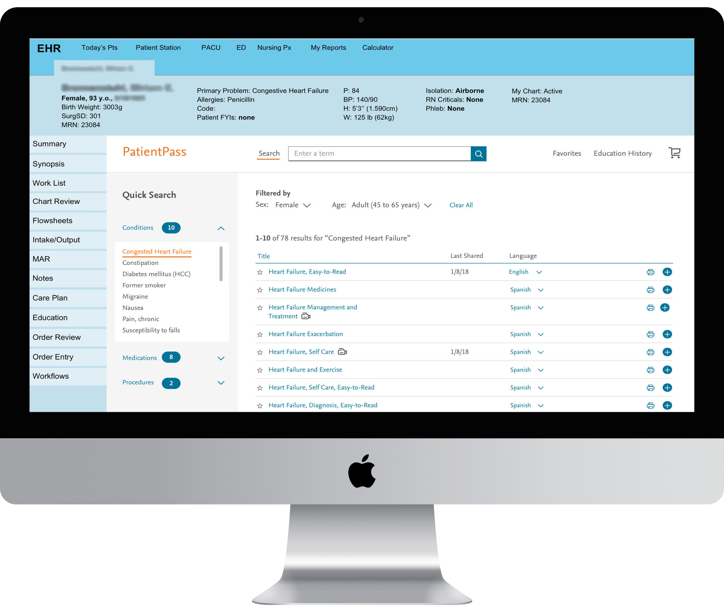
1. a solution that is actually smart
PatientPass fulfills its promise to provide a smart experience for clinicians and patients. No longer do clinicians need to search by the patient’s name, diagnosis, or treatment. PatientPass automatically brings up the most relevant articles based on the patient’s ailments.
2. sending patients education in the way they prefer
When clinicians are ready to send patient education, PatientPass sends it in the way patients want (text, email, and patient portal) as well as in their preferred language.